Thursday, June 18, 2009

bare shoulders, white feathers, and french paste


best hat (excuse us: "fascinator") at ascot...

Labels: , ,

Tuesday, May 20, 2008

flowers that remind of me of a starry night


as you guys might know if you're longtime readers, i'm getting married in september! our wedding theme is "UP!" ( the monogram of our two first names ), so i'm loving all things glowy, twinkly, night-sky-y right now.

these flower arrangements are so inspiring.....!

first image from Grace Ha-Kim's studio, Vale of Enna (seen at Brooklyn Bride)...& second photograph by michiko kon (via moon river).

Labels: , , ,

Friday, September 21, 2007

wanted? found...


on etsy! can't wait till it's delivered...

thanks to coco+ kelly, and to hoping for happy accidents for the link!

Labels: , ,

Tuesday, August 21, 2007

Julia Christie at Lumas: 21st century landscape photography

I've been reading a lot recently about 19th-century landscape painting... it's interesting to compare the perspectival confidence of Friedrich's 1818 "Wanderer above the Sea of Fog"

... with Julia Christie's bleached-out, 21st-century landscapes in which the small human figures are swallowed up even though the beach setting is ostensibly benign...


Seems in some ways similar to Zen Sekizawa's work,
although his take definitely feels more carefree (maybe because the figure, even though headless, is closer to us, and positioned at the top of the frame, like Friedrich's Wanderer)...

Julia Christie's starkly beautiful White Sands photograph series available for purchase at Lumas. Thanks to Angela for the great link to Lumas!

Labels: , ,

Thursday, July 19, 2007

lene toni kjeld: wallpaper that makes my heart go THUD THUD THUD


First..., I think I almost just passed out. Ode to Lene Toni Kjeld, she of the brilliant wallpaper that I must have! I'm so excited about the new directions towards which wallpaper has recently been heading, but I must say that this is particularly lovely, in that it feels contemporary but not in your face (gritty "toiles" and edwardian typescript "bite me" and other i'm-too-edgy-for-my-party-so-edgy-it-hurts kind of designs.)

Lene's wallpaper, on the other hand, is just unnervingly wonderful without being self-conscious or obtrusively tongue-in-cheek; I love its soft, crumbling texture, neutral metallic tones, its 21st-century nod to lace, and even fresco-- à la Timorous Beasties "Fresco" pattern... sigh. so so good.

But here's the thing. The seduction-that-is-European-artisanal- wallpaper has two significant cons, 1) price and 2) permanence. (Oh, and very possibly 3) a significant other who doesn't like wallpaper.) But does any of this deter Michelle of Armas Design? not at all! she recently suggested the genius idea of papering a large sheet of plywood (which allows us to escape 1), 2), and 3) in one go. Simple and brilliant. (Has anyone seen examples of such a thing?)

Lene...? Let's talk!

Labels: , ,

Tuesday, April 17, 2007

what about: a crisp black and white room ... with accents of emerald ceramics?


................................ +


.................................. =
Click to enlarge.

(So much fun to create style trays for fantasy rooms, no??)


* * Black & white kitchen via marie claire maison. gorgeous ceramic tile, "Taste of Water," from Giaretta, via Boulenger.

* * From collage... garden stool from Mecox Gardens; lamp from Marie Christophe; carpet from Madeline Weinrib; "Vega" watch from Nixon; Varenne chair from Casamidy.

Labels: , , ,

Thursday, March 15, 2007

stunning & affordable: furniture by London firm, Unto This Last


I'm blown away by the design of Unto This Last, a UK company based in London, that I just discovered via The Style Files. Their computer-generated pieces come in a range of different neutrals, and can be altered to your specifications (color, size; & free standing or wall-mounted for the shelving units) because nearly every piece is made to order.

The best part is that none of it costs much more than a piece of Crate & Barrel furniture, which is unusual for such unique pieces.... and exciting especially if you live in the UK, considering that the firm currently does not ship abroad! If you're planning on taking a trip to London any time soon, I highly recommend a trip to this shop, as much of the furniture can come flat-packed and would be easy to carry back with you. Or wait until the exchange rate gets better (right now it's around $1.9, alas).

...I'm thinking that this honeycomb shelving might just be worth a trip to London, exchange rate be damned.

Labels: , ,

Wednesday, February 28, 2007

vicki simon's deep sea felt rugs

mad for these felt rugs by Vicki Simon that Shelterrific's Allison has found. Fantasic. What inspires me is the line these pieces walk between abstract and figurative (just like the Zen Sekizawa photograph, below). Plus, they're so messy and scrawl-y that they poke fun at the seriousness of design, and I love that.

p.s: they really remind me of this amazing drawing that was posted last june on lena's blog that for some reason i haven't been able to get out of my head!

Labels: , , , ,

Tuesday, February 27, 2007

photography: zen sekizawa


this 2006 image by zen sekizawa is so atmospheric and leaves so much unsaid... i love how it walks the line between abstract and representational art.

Labels: ,

Thursday, February 22, 2007

sartorialist... i must have been asleep

Tuesday, February 20, 2007

color trend...: super baby pink


i think amy at the great new blog design dna is on to something: a color that she charmingly calls "super baby pink" as in "the super baby pink outdoor cushions are speaking to me." if you're looking for an alternate to the beautiful (yet already ubiquitous) bright citron colors of the season, you may want to consider it. (eg, as a ceiling color in an all-white room, say.)

(oh, and don't let its softness deceive you. nor should you be tempted to mistake it for the preppy irony of a jcrew pink. this is something else, a barely-there hue. maybe we should think of it as a subversive off-white.)


... will update you on this one!..


UPDATE! 4 april:

paperpony via d*s

UPDATE! 30 april:
Martha Stewart's guest house on the cover of the May MS Living...

Labels: , ,

Friday, February 09, 2007

unexpectedly dazzling: 17th century botanical drawings of magnified roots


These are 17th century botanical images of magnified sections of plant roots, from around the time, I'm assuming, of the earliest developments of magnifying instruments. Coolness of the science aside, I am imagining these as images on silk scarves, or as a series, printed on canvases. So beautiful. Reminds me a bit of this post that lena had up a while ago....

From The anatomy of plants. With an idea of a philosophical history of plants. By Nehemiah Grew, 1682. (love the name nehemiah. so old testament! up there with Obadiah for most beautiful old new england names...)


& happy friday!... xp

Labels: , , ,

Monday, January 29, 2007

sculptural chairs: white on white


"White on white" has been a look I've always been cuckoo over, and have been exploring since silk felt soil began.... More and more I am loving whites when they are layered in different textures, and given crisp structural dimension. I can't get enough of the first photograph of legless chairs, via Marie Claire Maison. It requires a Diana Vreeland-type "Why Don't You... take the legs off your chairs and turn them into a banquette?" great space saver...

Images 2 and 3 courtesy of Côté Maison and Casamidy.

Labels: , , , ,

Wednesday, January 03, 2007

unlikely fusion: porcelain and sea sponge make a startling vessel for flowers

oh, the possibilities offered by this oddly enchanting porcelain natural-sponge vase... how gorgeous would it be with soft, fluttery peonies, drooping over its rough sides?

According to Poaa's website, Marcel Wanders's design is made by sinking real sponges into fluid porcelain; in the kiln, the sponges burn away, leaving a perfect copy. Not crazy about the lip of the vase, but other than that, I am a fool in love for this design sponge. Would love to see a version made into a table lamp.

via the style files, a fun new blog i just discovered.

Labels: , , ,

Wednesday, November 29, 2006

recycled design, etsy-style: envelopes that play with scale


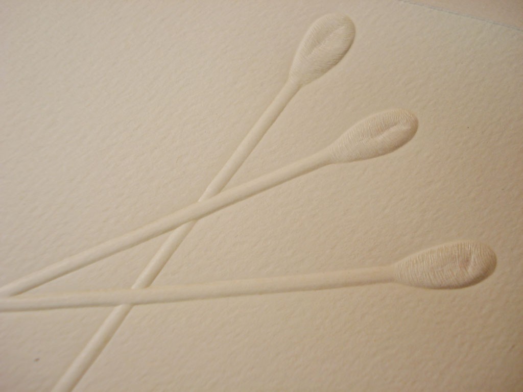
An Etsy shop, Bellis Celebrations, gives PR mailings a second life:

"I'm a graphic designer and some of the paper promotions and stock photography brochures I get are just beautiful. Too beautiful, I just can't bring myself to throw them away."


I love the hugeness of the Q-Tips and the precariousness of the window-washer...

Each set of envelopes around $2 here. Or, make your own. Just recently, I made some envelope liners using images from an old New Yorker; it was fun to give a small, unexpected jolt to the inside of a plain envelope, like La Perla under jeans!

Labels: , , ,

Thursday, November 09, 2006

william morris wallpaper: "sunflower"


This is one of my favorite William Morris wallpapers. I love how dense the pattern is-- it's like the 19th c. equivalent of Tord Boontje! Last December I actually ordered a sample from Charles Rupert of this print, and I'm still quite taken with it. Too bad my main man isn't a fan of wallpaper, full stop! Hopefully he'll turn around...

Note that Charles Rupert is a Canadian company that makes reproduction William Morris patterns and has not, to my mind, realized its true potential yet (in terms of modern tastes, one has to be a bit patient to find great prints); that said, I've noticed that Domino and Blueprint have both found CR, so likely we'll see some reformulations of their colors, and so on, in the near future as they adjust to a new audience.

Labels: , , ,

Monday, October 09, 2006

sculpture: robert delves


Robert Delves is an aussie sculptor who works with found objects (here, remnants from old boats). I love the textures in this piece.
Via the Australian boutique, Pomme.

Labels: , ,

Tuesday, September 26, 2006

The translucent tableware of Galleria Primavera

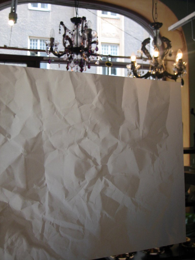
a. b. c. I found these pieces in a diminutive shop in Helsinki called Galleria Primavera, and held them up to the light to show how sheer the mini-trays (pics b and c) and table-mats (pic a) were. I esp. love the "crumpled" image, which is really a photograph of crumpled paper, transposed onto the table mat. Even though I don't often find myself drawn to tableware made of synthetics (here, polypropylene), these seemed wonderful in their milky transparency. A great, kid-safe setting. Note that they are madly affordable, 2-5 euros each. for info, contact galprima@galleriaprimavera.fi, as they don't have a website currently.
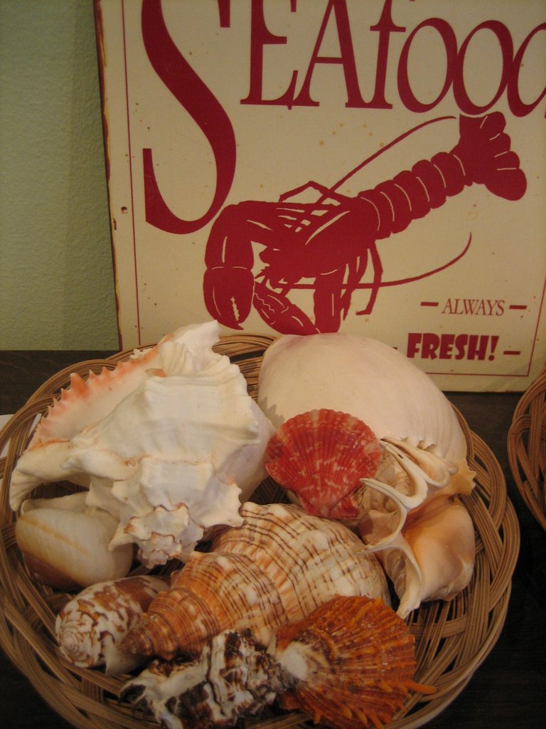
With its chandeliers and shells and dishwasher-safe table mats, its gleaming orange porcelain boxes (and on and on), Galleria Primavera definitely won me over.
That said, I guess I always enjoy spending time in teeny tiny boutiques; they tend to feel like labors of love from eclectic, passionate curators.

Labels: ,

Monday, September 18, 2006

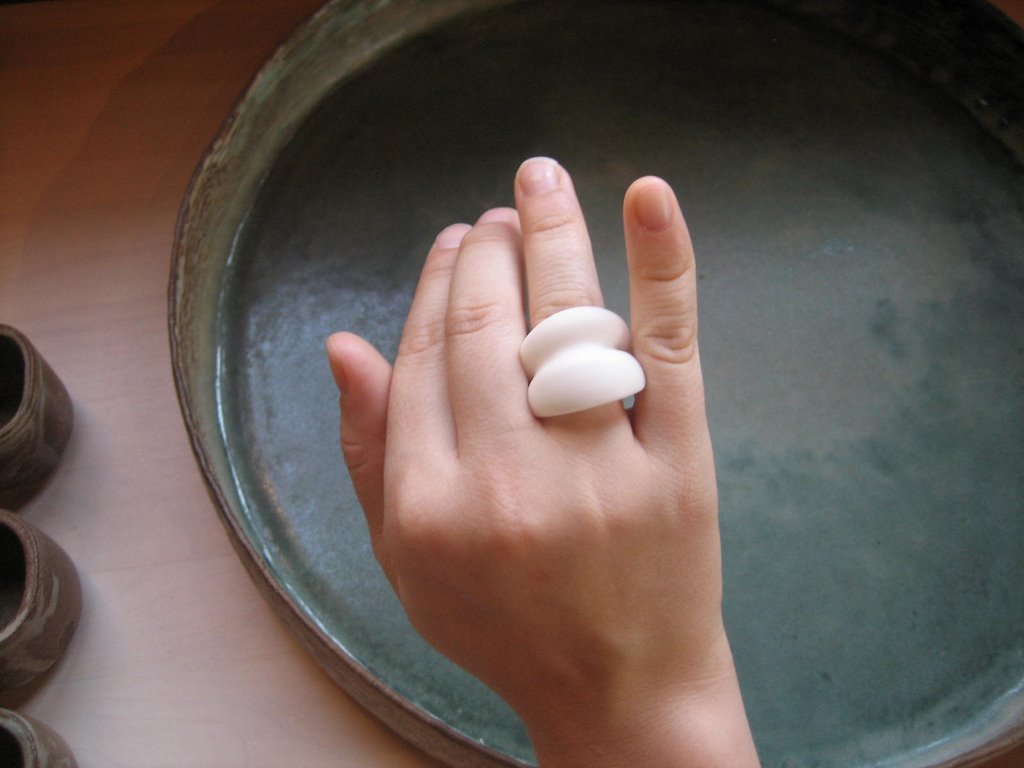
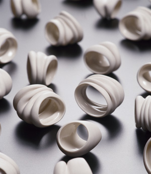
Oversized ceramic rings from Johanna Ojanen


Johanna Ojanen is a ceramicist whose workshop Pot Viapori is located on the tiny (yet oft-visited) island called Suomenlinna, off the coast of Helsinki. She sells her pieces in a boutique on the island. I loved the organic, graphic quality of these large, almost 'anti-cocktail' cocktail rings-- very simple, clean, and beautiful. They come in white, clay, and black. Her website is in Finnish, so you might prefer to find out more about her via email, at potviapori@viapori.fi

Labels: , , ,

Thursday, July 06, 2006

white on white (and a little gray)

The American Folk Art Museum in Manhattan is having an exhibit called White on White (and a little gray), that I am longing to see. Though I naturally gravitate towards rich, saturated colors -- dusty cocoas and indigos and apricots and guava and shrimp pinks -- the New England girl in me somehow is also very attracted to the most spartan, neoclassical of palates...white enamelware and unbleached linen and bare, wide-planked wooden floors.


These corbels, (from the wonderful architectural salvage store Nor'East) belong to that spartan side... I just love them and wonder what one could do with them if one doesn't happen to have a building in need of structural support! They remind me of the pieces of white coral that adorn people's coffee tables and dressers in magazines... they also remind me of Georgia O'Keeffe-esque skulls ... Maybe they would look elegant on a console, proudly retired to the realm of the decorative?

Labels: , ,