Monday, September 06, 2010

dance and repose: carolyn anderson


Just discovered Carolyn Anderson, an extraordinary contemporary painter. (click on the photos for larger images.) It would be interesting to see what she did if she moved out of her comfort zone of 19th c. subjects, but either way, what she's currently doing is pretty incredible. The sense of motion conveyed in the Native American dancer is inspired. You can feel that shuffling, rhythmic, explosive, moccasin'd step...

Labels: ,

Monday, July 27, 2009

writing on book design at Best American Poetry this week


This ravishing smudgy birthday-card painting is by David Lehman, poet and founding editor of the Best American Poetry series.... click on the image to see it up close. so good. (notice how words always somehow sneak into poets' paintings......!)

I mention this today because I'm visiting as a guest blogger at the poet-painter's Best Am Po blog this week, writing about book jacket design, and interviewing poets on their favorite cover designs. so much fun!

come visit
!

bacci,
p

Labels: , , ,

Friday, June 26, 2009

watercolor silhouettes, in reverse


refreshing and beautiful pairing of the crisp, sharply defined letter and the playful fluidity of the stained, saturated paper. would be great for cards to friends, large posters, homemade book covers, numbers for tables at weddings...(no need to do the watercolors so brightly, right? could do them in soft pinks and navy, or as you like...)

or try an animal shape-- a flamingo, an elephant, a giraffe, and paint over them in a range of tones of the same color, for a series.


spotted on AT's children site...

Labels: , , ,

Friday, August 24, 2007

a tip.

When it comes to rifling through an assortment of prints, paintings, sketches, pillows, rugs, anything (whether online, e.g., on ebay, or even in a shop), and you can't decide how to choose, try out my pet strategy:


... ignore your knee-jerk favorites. Blast past the "pretty," and take a closer look at the "ugly": and by "ugly" I mean the one piece that you would ordinarily dismiss straight away, the item that you unconsciously register as the least appealing of whatever group of images you're looking through. (eg, with botanicals, blast past the peaches & give the dingy print of the warty gourd a little love.)

Rationale: the "pretty" is probably just what you're used to. The "ugly" is unfamiliar. Often that first jolt of "Hell no" is actually a good way to discover something new.

"Jolie laide" fish prints from The Old Print Shop (online, or stop in if you live in the NY area; looks like a great shop. 150 Lexington Ave between 29 and 30th).

(ok, now that you've heard me out, tell me I'm wrong. I can take it.)

Labels: , ,

Thursday, August 23, 2007

back to school = cool online industrial supplies

In exploring the coolest online resource ever for affordable, modern shelving, etc, etc, etc; thanks Blueline!), i found this "map rail," lined in cork and full of fun clips and so on, which is $15 for 4'. I think the graphic stripes of cork and steel would actually provide a stunning and unexpected graphic pop, like a really great belt for your walls, in an entryway (stay tuned....!) or an office, & used all around the room. What a fun alternative to a traditional picture rail: easy to install, and a no-effort way to hang (and re-hang) your gallery .... kind of like a more yang version of mav's ethereal inspiration line, which I've never been able to get off my mind.

Labels: , , , , ,

Tuesday, August 21, 2007

Julia Christie at Lumas: 21st century landscape photography

I've been reading a lot recently about 19th-century landscape painting... it's interesting to compare the perspectival confidence of Friedrich's 1818 "Wanderer above the Sea of Fog"

... with Julia Christie's bleached-out, 21st-century landscapes in which the small human figures are swallowed up even though the beach setting is ostensibly benign...


Seems in some ways similar to Zen Sekizawa's work,
although his take definitely feels more carefree (maybe because the figure, even though headless, is closer to us, and positioned at the top of the frame, like Friedrich's Wanderer)...

Julia Christie's starkly beautiful White Sands photograph series available for purchase at Lumas. Thanks to Angela for the great link to Lumas!

Labels: , ,

Tuesday, July 31, 2007

our Twombly has arrived from Sotheby's! (kind of).

Back in December I mentioned that I was coveting a huge piece of slate to put up in the living room like a pseudo-painting. Well, we might be almost there!

Over the weekend, my mom and I took a roadtrip up to Maine, & on the way back home yesterday evening, we stopped in Kennebunk to check out Old House Parts, an architectural salvage shop, to see their inventory of vintage blackboards. Prices were a little bit prohibitive, but we still managed to bring back a decent sized piece of slate to hang up in living room over what will become a "games" table/ dining table. I figure it will look pretty all on its own, and when friends come over to play bridge (wink wink Roxy), we can use it to keep score.
Will post some pictures in August, when it's up!

(image of Mariette Himes-Gomez's kitchen blackboard via NYSD.)

Labels: , , ,

Tuesday, May 01, 2007

dong kingman, zao wou ki: mid-century poster art and illustration


Mid-century illustration and watercolor touch me on a very personal level because i grew up reading over and over again the picture books of my parents' generation (1940s-1960s), which they had saved, and loved to see me enjoying as they had. So the chaos of color and the shapes and typefaces and all of it is like coming home.

Dong Kingman is one of our great mid-century watercolorists. I hope these travel posters give you a surge of excitement as they do for me.

(The first for sale here, and the second here; or try this ebay print for a more wallet-friendly version of the 2nd.)


I love this one too, so so much, a 1968 lithograph by the abstract painter Zao Wou Ki.


DIY tip: if you enjoy this style of mid-century graphic design and illustration, try scanning an image from a children's book of the period and framing it (I'll be doing this in the next couple of weeks!). There are so many possibilities; try checking out the wonderful Flickr group, Retro Kid; or browse the Japanese site, CurioShop, for thumbnails of a truly stunning collection of mid-century illustrators and their work.


... et finalement, joyeux anniversaire à mon cher papa, et à la belle mathilde aujourd'hui!

Labels: , , ,

Thursday, April 26, 2007

dark-toned art on lemon walls: vintage oil paintings


I love the warmth of lemony walls, but sometimes they feel a little too peppy; the shadowy feeling of these dark still-life paintings tones down the pep and adds some depth and dimension, plus a little edgyness.


as we all know, Ebay is a great place to look for undiscovered (and hence affordable) artists. Check out this one by Lila Shelby, a mid-century Southern painter. Love!


(note: the clock is ticking on this piece...auction ends this afternoon.)

First image from Domino, May '06; the second from Martha Stewart Living Sept '04.

Labels: ,

Tuesday, March 27, 2007

spring fever: stencil project

whew!!!

i've been really industrious at home, organizing and sorting like mad-- my version of spring cleaning. happily, i'm about ready to start one of the projects that i'm really excited about: stenciling a coffee table. I've never done this before, so it should be fun! Here are the components of the project that I've decided upon so far:

* white high gloss oil paint as background, black paint for image/letters.

* stencil will be hand-made by me, and extra large, by way of a projector.

* stenciled image will probably come from an antique book of mine from childhood, but could be something like this...


though i think i'm going to try for something a wee bit more simple. this ceramic jar from speller milner is inspiring me right now so much...:


i will update you-- should be done next weekend!

some of the stencil resources i've been using:
*how to make huge stencils using a projector
*AT's good question on stenciling
*craftster's comprehensive list of stenciling resources & info

(has anyone ever done a stencil project using a handmade stencil? would love to hear about it....)

Labels: , ,

Friday, March 02, 2007

c. f. a. voysey wallpaper and textile illustrations


am loving the early 20th c. arts & crafts designer c. f. a. voysey.

these are two preparatory illustrations for potential designs (carpet, and wallpaper) that he sketched. I wonder if current wallpaper designers sell sketches of their designs-- I think those images would be lovely pieces of artwork, in between finished wallpaper and actual illustration.


(image via de gournay).

happy friday!

Labels: , , , ,

Tuesday, February 20, 2007

small spaces at home: try a painting or photograph gallery


images, from top: david netto design; southern accents via style court; marie claire maison.


PS: confession-- as much as I love clusters of paintings or ordered groupings of photos, I am a bit of a perfectionist and thus take a verrrry lonnnng time in putting up art in the house. This time around I'm thinking of starting small, doing a gallery of my brother's amazing b& w photographs [H*A*P*P*Y B*I*R*T*H*D*A*Y, JAMIE!] from top to bottom of one wall in our 'thirties b & w tile bathroom. Would welcome thoughts or suggestions! xx p

Labels: , , ,

Tuesday, February 13, 2007

karenina fabrizzi, paintings


i admire the tension in karenina fabrizzi's work between its rough messy quality and its delicate softness....

Labels: , ,

Monday, February 12, 2007

"watercolor" pillow from habitat


designed by genevieve bennett for habitat. cotton sateen. (£25)

swoon!

Labels: , , ,

Thursday, December 07, 2006

blackboards, cy twombly, and architectural salvage


Old chalkboards, blackboards, are the stuff of my fantasies, no joke. This fine specimen (from decorator Mariette Himes-Gomez's NYC apt) is almost an exact match of a serious and enduring fantasy that I've been having recently about a large chalkboard -- not for the kitchen (don't have the space) but in the living room, in lieu of a large painting. I've been toying with the idea, wondering if it would work, ever since I found out that Old House Parts, a local architectural salvage resource, is currently selling slate from old schoolhouses for $10-14 a sq foot...


The kitchen image above convinces me more and more that a large old blackboard is not just a passing fancy of mine. And, after all, the way I see it...


it's a pretty nice stand-in until Sotheby's gets around to shipping our Twombly.

Labels: , , , , ,

Wednesday, December 06, 2006

mat daly and phaidon's vitamin D (d for drawing)


Warm thanks to la belle Mav for calling attention to Mat Daly's fantastic graphic work. (See here for Lena's faves). Mat, if you're reading this: I think you should do covers for the New Yorker... I think they'd love your stuff.


This diagram/mind-map poster reminds me of the gorgeous dust jacket of Phaidon's "Vitamin D" book.

Labels: , ,

Wednesday, November 15, 2006

the surreal proportions of Volckamer's 18th c. botanical prints


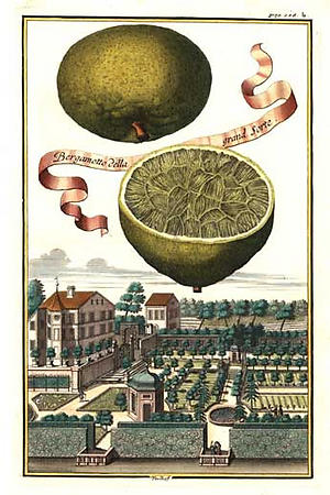
Thanks to Giornale Nuovo for this incredible feast of startling but yet endearing images from Johan Volckamer's Nuremberg Hesperides. G.N.'s source suggests that these prints, generated from a wintry German countryside, show a longing for the warmth of the Mediterranean that only the wealthy could afford by means of hot-houses and orangeries. ("Hesperides," I've just learned, is a synonym for "the blossom garden culture of the 1650s to 1800s"). The citrus fruits here do seem to have become substitutes for large, looming suns...

I would so much love to have one of these prints to brighten the winter, together with, I think, a Meyer lemon tree.

Labels: , ,

Sunday, October 29, 2006

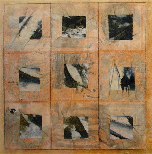
Paper mosaics, paper quilts: Karen Jacobs's bokusho paintings

Almost like black and white photographs that can't quite be identified, or, as in the case of her "Reversi," like faded indigo cloth torn from an unknown whole, Karen Jacobs's paintings are incredibly evocative and exciting... I love how they toe the line between abstraction and figuration, energetic chaos and reigned-in order.


This watercolor of a sycamore is one step on the evolutionary ladder, believe it or not, of Karen's bokushu paintings. The (illustrated) story of the paintings' development from figural to abstract can be found here.

Labels:

Wednesday, October 04, 2006

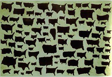
Kim Dingle's "United Shapes of America"


Thanks to Annie of Woodblock Dreams for mentioning this incredible Kim Dingle painting, entitled "United Shapes of America," which was inspired by real drawings of the US by schoolchildren. Unsettling and yet touching at the same time...

Labels:

Friday, September 22, 2006

Found Object: wall of a building in Trinity College, Cambridge, UK


I took this photo because the wall (in Trinity) reminded me of Klee's paintings...

Paul Klee. Bust of a Child, 1933. Image courtesy of my alma mater.

Labels: ,