Sunday, October 29, 2006

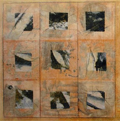
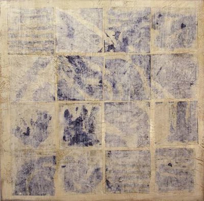
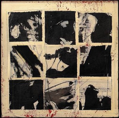
Paper mosaics, paper quilts: Karen Jacobs's bokusho paintings

Almost like black and white photographs that can't quite be identified, or, as in the case of her "Reversi," like faded indigo cloth torn from an unknown whole, Karen Jacobs's paintings are incredibly evocative and exciting... I love how they toe the line between abstraction and figuration, energetic chaos and reigned-in order.


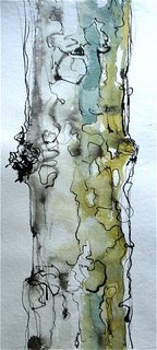
This watercolor of a sycamore is one step on the evolutionary ladder, believe it or not, of Karen's bokushu paintings. The (illustrated) story of the paintings' development from figural to abstract can be found here.

Labels:

Thursday, October 26, 2006

can't get enough of: antique stoneware bottles


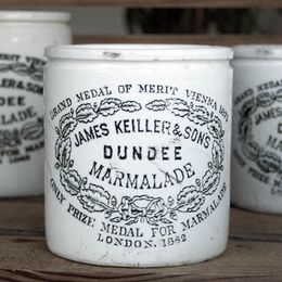
Hooray! it's my birthday! so i've chosen one of my Favorite Things to spotlight today, purely for inspiration's sake: British stoneware bottles. Love these so much. I grew up with my grandmother collecting Dundee marmalade jars and storing paintbrushes and pens in them, so they have a special place in my heart.


Images courtesy of (from top); dianemariet's flickr stream; colonel blink's flickr stream (images 2 and 4); willow and stone, a UK company; and, my favorite, Rattibo's flickr stream-- check out her "antique" tag. Gorgeous photos of a small child clutching large stoneware jars.)

Labels: ,

Tuesday, October 24, 2006

Updating velvet cushions with hits of white.


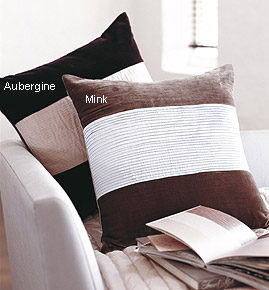
I love how these sexy velvet cushions have been freshened with accents of white-- in the one case, with white taffeta trim, and in the other, with a pleated taffeta panel, kimono-style. Maybe I'll try out a homemade version.

"Garbo" cushion (top) and "Loren" cushion both from London's The White Company. (Wish we had it here... some of their things are so simple and lovely. Take a look at these ephemeral tea light votives...)

Labels: ,

Monday, October 23, 2006

a treat: business cards from the Black Pearl Press

Soooo excited: my main man decided to give me some business cards for my upcoming birthday, and so this past week I had a glorious time picking a local letterpress to work with. After many tantalizing options, such as Dear Olive and The Goosefish Press, I finally settled on Elisabeth's Boston-based Black Pearl Press...
When the cards are done, I'll share them... and for now, here's some examples of Elisabeth's impeccable work. mmmmm!


note: her website is being updated and should be up and running later today...

Labels:

Friday, October 20, 2006

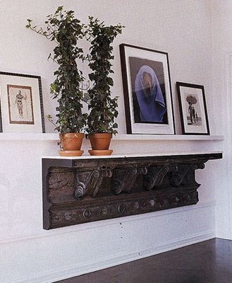
Design into practice: entryways (share your favorites!)


Last night, I was in a bit of a frenzy tidying up the entryway of our new home, (which we've painted the most beautiful, deep, slate grey... Pictures to come... je vous jures) and I realized that in small apartments, entryways have to be highly efficient & functional little ladies, and yet look like they're sipping champagne.

Here's the fun part: I'd love a little more inspiration. If you have pictures of entryways that thrill you, (yours in fact or yours in spirit) would you send them to me? I'll post them if I get a bunch...! don't be shy...

xx phoebe


Swoon-worthy NYC entryway designed by Vicente Wolf; image courtesy of Alex and Cargo's flickr stream

Labels:

Tuesday, October 17, 2006

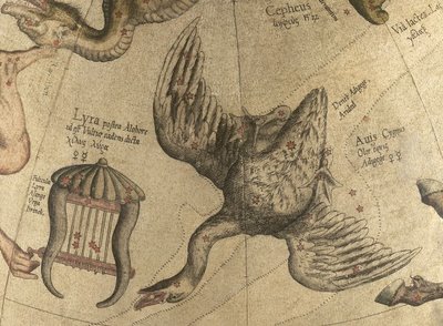
Ships and swans: constellation illustrations

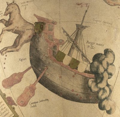
"argo navis"
"lyra" (lyre) on the left, and "avis" (bird) on the right.

These dream-like illustrations of constellations are in fact details of a 16th century celestial globe (1551), called the Mercator globe, in honor of its maker, Gerard Mercator. I love the subdued colors and the anti-gravity feel of the images.

Images courtesy of the Harvard College map collection.

Here's an example of a 19th century celestial map that I wrote about this summer....so different, yet each so perfect in its own way.

Labels: , , ,

Monday, October 16, 2006

Aiko Machida strikes a chord

Phoebe picks up on Joy picking up on Abigail's amazing find: Aiko Machida. Shall we join in? We do love her leather baubles!

Lovely layout design by Joy

Labels:

Startling shapes: puppets

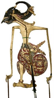
*A Javanese shadow puppet. For other shadow puppets, see here...

When I was little I used to wake my father up at 4 in the morning (I kid you not)and slip puppets on his hands. Barely awake, he would groggily begin to speak in the voices of "Monkey," (high pitched; excitable) and "Foxy," (a thick french-canadian accent, very calm and mature), our main puppet players. This was our morning ritual for many years! My father, one of the best storytellers I know, swears to this day that the puppets on his hands would use expressions and offer insights that he would be surprised by.

In honor of those mornings, here are some more images of traditional and contemporary puppets....

Traditional puppets (by artists from India):
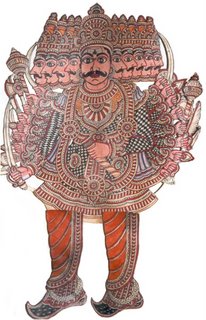
*Leather puppet from Rajasthan, India, depicting Raven, a terrible villain. For some fascinating images of Indian leather puppets, see here.
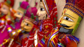
*"Kathputli," typical Rajasthani marionettes. Gorgeous photograph by Ewan Bell.


Contemporary puppets (by artists from africa, europe, and the us):
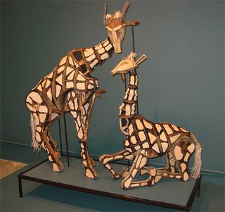
*Giraffe puppets from "Tall Horse," a production by The Handspring Company, South Africa, featured in the current traveling exhibition, At Arms' Length: The Art of African Puppetry.
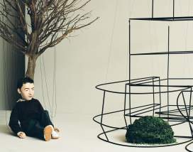
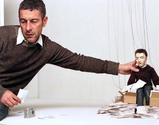

*Production images from a film by Pierre Huyghe: the 24 minute This is not a time for dreaming concerns Corbu's design of the Carpenter Center at Harvard. Huyghe's film was commissioned by the University in 2004, and is currently being exhibited at the Portland Art Museum in Porland, Oregon, until December 26, 2006.
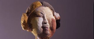

*Head of a piece by the sculptor and marionette-maker Anne Chu. Watch for her upcoming exhibit at the Donald Young Gallery in Chicago.

Labels: , ,

Friday, October 13, 2006

1940's Friday: Little Lulu


I'm full steam ahead at work today... so I wish everyone a very nice weekend by way of Little Lulu, a cheeky cartoon from the late 'thirties, early 'forties about a naughty little girl, created by the inimitable Marge Henderson Buell.

In getting to know Little Lulu, do stay far away from the comic books (MHB had little to do with these), and instead take a look at some of the charming and silly collections of the magazine cartoons. A great present for a small friend...

(See here also for an earlier take on childhood "comics"....)

Labels:

Tuesday, October 10, 2006

letterpress: a little rant.

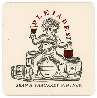
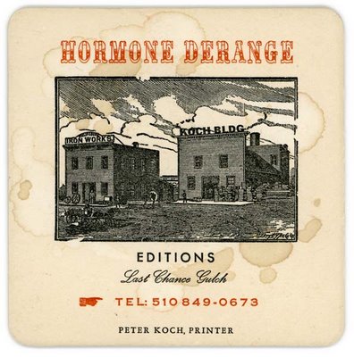
Peter Koch's letterpress work, especially his ephemera, is so. damn. fine.


Here's the thing.

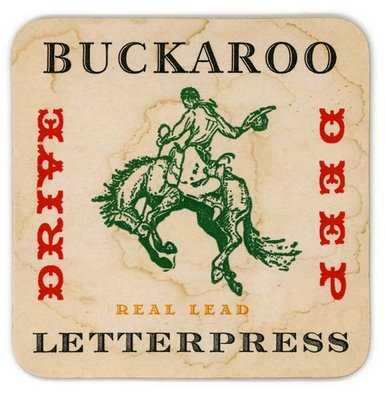
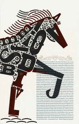
I like rough, mad, brazen letterpress. I like my letterpress single-malt, straight up. I like it with lots of typeface-- really amazing, old-school typeface. and I like it used, splotchy, like it's been somewhere. I don't want it pristine. I don't want it pretty. I don't want it cutesy retro. I want it unapologetically regressive, so out-of-date that it's not. I want it devil-may-care, with fire in its belly.

Typographical Horse, designed and printed by Christopher Stern, of the WA-based letterpress Stern & Faye.

Labels: ,

Monday, October 09, 2006

sculpture: robert delves


Robert Delves is an aussie sculptor who works with found objects (here, remnants from old boats). I love the textures in this piece.
Via the Australian boutique, Pomme.

Labels: , ,

Casamidy: ornate minimalism from Mexico

Three suggestions for getting to know the Mexican design firm, Casamidy, through their glorious website:

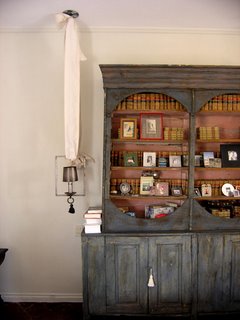
1) Take a look at their self-declared inspiration board. So much goodness. (Note the fun idea of hanging a sconce with a huge sheet of white cotton....)

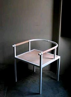
2) Do as AT does, and check out the new "Selle" chairs in raw leather from the Rue Conde line.

...or the Varenne line. (Jonathan Adler has had the opera chairs made for himself in green! I myself covet
the opera side chair in white.)

...or the tray tables in the Symi line. heaven.

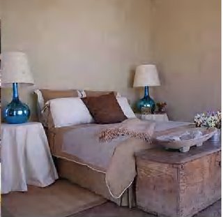
3) Make yourself a cup of coffee spiked with cinnamon and settle down to browse through the portfolio of the interior design work. (Here, farmhouse gets an update with cheeky blue metallic lamps.)

[update: thanks so much to Ted Conn, designer of Casamidy's website, for sending along the hi-res image of the sconce!]

Labels: ,

Saturday, October 07, 2006

"Susan Sontag, Petra, Jordan, 1994" - by Annie Leibovitz


Photograph by Annie Leibovitz, from her newly-published retrospective, A Photographer's Life, 1990-2005 (New York: Random House, 2006). Image courtesy of The New York Times, October 6, 2006.

Labels:

Friday, October 06, 2006

in its raw form: indigo dye


Indigo dye is one of the most startling, inspiring natural dyes, it seems to me. Just found these pictures in an article about the intricate dye-making process, shot by Marie Clérin for the Sept/Oct 2006 Maison Francaise, (one of a number of magazines belonging to a French interiors magazine group, Côté Maison, that I've recently been poring over....)


I don't understand how "blue" ever got to be a word about feeling down. These blues lift me up, up.

Labels: ,

Wednesday, October 04, 2006

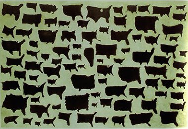
Kim Dingle's "United Shapes of America"


Thanks to Annie of Woodblock Dreams for mentioning this incredible Kim Dingle painting, entitled "United Shapes of America," which was inspired by real drawings of the US by schoolchildren. Unsettling and yet touching at the same time...

Labels:

Tuesday, October 03, 2006

Catalan taste


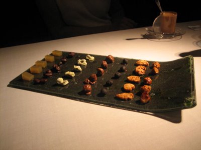
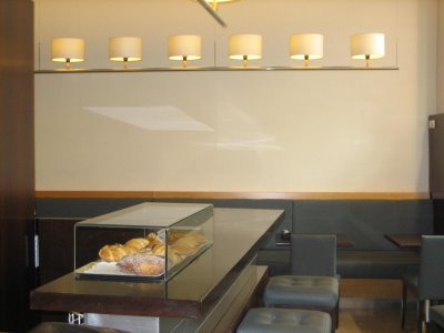
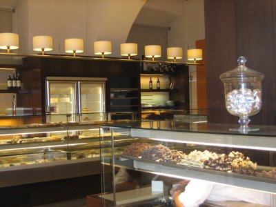
I would really like to find out who designed the elegant lighting in this posh Catalan pastisseria that I visited while in Girona.

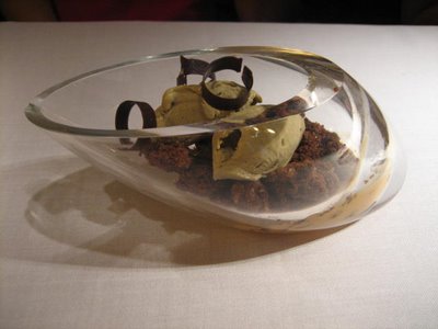
On that sweet note, here are some photos of beautifully plated dolce that were served to us at the end of a decadent lunch that my friend Anna's parents treated us to. I loved the tiny palmiers, the size of your thumbnail (second from right), and the chocolate cake served in the deep glass bowl.


Labels: , ,

Monday, October 02, 2006

luxury: textured wool carpets for winter


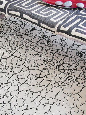
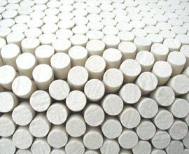
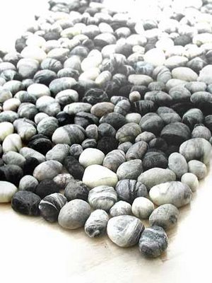
Design agent did a stunning post on topographic design recently, which I've been meaning to mention, especially to note the paris cityscape rug (third from top) by Hive Space that she found (doesn't it look like snow drifts?). Both it and Hive Space's "circulation" pellet rug (2nd from top) are so very lovely.

I also found myself swooning this morning over these carpets (top, bottom) by the Norwegian firm, 2Form. (Thanks to grassroots modern, via AT, for the link to 2Form!)

Labels: , ,